Interface design
Structural design
Section titled “Structural design”This chapter is not about graphic design but about structural design. It comes very early, because containers really are the basis of interface design in x4js.
As a reminder, graphic design is done in CSS (or SCSS).
Splitting a page
Section titled “Splitting a page”Take a classic application page: a header with a logo, navigation buttons and the user’s avatar, then a title, then the content.
This page is made of containers, either horizontal or vertical:
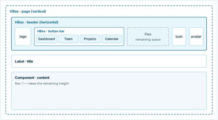
- The page is a vertical container: elements are added from top to bottom.
- The header is a horizontal container: elements are added from left to right.
- The title is a standard element.
- The content is a container that takes all the available space. This behaviour is called “flex”.
In the header, an empty flexible element is placed after the button bar: it pushes the rest to the right.
The code
Section titled “The code”To reproduce this, use HBox (horizontal container) and VBox (vertical container).
import { Button, Component, Flex, HBox, Image, Label, VBox } from 'x4js';
// the page (vertical)const page = new VBox( {  cls: "main-doc",  content: [    // the header (horizontal)    new HBox( {      cls: "header",      content: [        // logo        new Image( { cls: "logo", src: "img/mark.svg" } ),
        // button bar (horizontal)        new HBox( {          cls: "btnbar",          content: [            new Button( { label: "Dashboard" } ),            new Button( { label: "Team" } ),            new Button( { label: "Projects" } ),            new Button( { label: "Calendar" } ),          ]        }),
        // flexible element        new Flex( ),
        // icon        new Button( { cls: "msgs", icon: "var:icon-bell" } ),
        // user avatar        new Image( { cls: "user", src: "img/avatar.jpg" } ),      ]    }),
    // page title    new Label( { cls: "title", text: "Dashboard" } ),
    // page content    new Component( { cls: "content", flex: 1 } ),  ]});
Everything else (colors, margins, sizes) is set in CSS, from the classes given in cls.
Available containers
Section titled “Available containers”| Container | Role |
|---|---|
HBox |
Lays out its children horizontally. |
VBox |
Lays out its children vertically. |
HSplitBox, VSplitBox |
Like HBox and VBox, with a resize bar between the panels. |
StackBox |
Stacks pages and shows only one at a time. |
GridBox |
Places its children on a grid of rows and columns. |
Tabs |
Pages reached through tabs. |
Flex |
Empty element that takes the remaining space. |
Space |
Empty element with a fixed size. |
Sharing the space
Section titled “Sharing the space”Three properties, common to all components, are enough in most cases:
widthandheightset a size;flextakes the remaining space. With a number, flexible elements share the space in proportion.
import { Component, HSplitBox, Listbox } from 'x4js';
// a 250px list on the left, the rest for the content,// and a bar the user can drag between the twoconst split = new HSplitBox( {  flex: 1,  content: [    new Listbox( { width: 250, items: [ { id: 1, text: "First" } ] } ),    new Component( { flex: 1 } ),  ]});
In an HSplitBox, the flex panel takes the remaining space, and the bar resizes its neighbour.